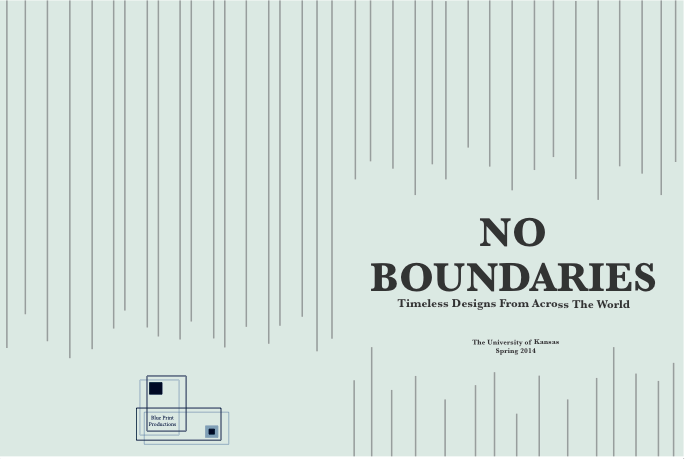
Here are the final layout pages of my book
Elle Javier
Thursday, May 8, 2014
Overview of Book Project
The putting together of this book was different from anything that I had ever done before. It was both stressful and rewarding at the same time. The making of the layouts of the book was probably most enjoyable for me. Something that I wish I could have worked on more was many be title page. I felt that it could have been a lot better and flowed with the rest of my book better. As for the book construction and printing it did cause a lot of stress trying to get everyones layout together and printed but in the end it will prepare me better for working in the real world and it is a good lesson. My time in BDS in now over and I get to now move on to classes that are more in my major. I have learned a lot from this class both this semester and last semester. I have learned things about other majors that I never would have known without it. It also pushed me to expand from my comfort zone in ways thatI never thought that I would do. I hope that one days these skills will come in handy at a point where I least expect it.
Wednesday, May 7, 2014
Book Title and Publishing Logo
The title "No Boundaries: Timeless Designs From Across the World" was something that my group came up with. We had a wide range of designers in our group. Charles and Ray Eames are classified as Architects as well as Industrial Designers. Massimo Vignelli is mostly known for being a graphic designer as well as the master mind behind some beautiful type. Kelly Hoppen and Philippe Starck are both interior designers. As for Karim Rashid he is a designer of many different things. All of these designer have a wide variety of design ethics. They also all come from all over the world which was why we choice the name choice that we did.
The publishing logo name that we chose "BluePrint Publishing" came with the idea that all of our designers have something to do with buildings a some sort of layout. Here is a picture of the logo that I designed.
The publishing logo name that we chose "BluePrint Publishing" came with the idea that all of our designers have something to do with buildings a some sort of layout. Here is a picture of the logo that I designed.
Tuesday, May 6, 2014
Biography and End Sheets
Here is the design pattern that I made to put as my end sheets. It follows the color scheme that I have followed for my whole book as well as a pattern that is simple and toned down so that it is not to distracting.
Writing a biography about myself was something that I had a hard time coming up with. I was not sure what to write about myself. I also had to change the voice that it was written in because bios are not suppose to be written in first person. In the end I wrote about what I like to do in my free time and where I am from.
Jacket Cover
Here are the two jacket covers that I had come up with. The first one had a map of the world to show that our designers are from all over the world and that there are no boundaries between them. In the end I decided to go with a geometric shape cover because it is something that relates more to my style of design as well as connects to Hoppen's design in a way.
Table of Contents
Here is the final page design for my table of contents. Instead of taking a picture of each designer I decided to take a picture of their work because that is what they are known for. I did this type of picture and number idea for all of my initial table of contents but just arranged in different shapes.
Here are my first layout designs
And this is the final Table of Contents that I decided to go with
Title Pages
I had a few different ideas for what I wanted my title page to look like. I could not decide if I wanted to keep it really really simple and keep it white with just a little bit of color or if a background color would be too much. At first I thought that the the color that I chose was light enough for a background color. And after looking at it a little more I decided to take the color out all together and just leave the background white. Here were a couple of the designs that I had first come up with.
and here is my final:
Final Page Layouts
The bar of color and pictures from my initial page layout was something that I continued to use. I ended using that as my second layout page. I had a bit of trouble with my first page. I could not figure out how to display more of Hoppen's work so that the viewers would be able get up close and actually see it. In order to fix this problem I ended up making the first page layout one big picture with her name displayed and a inspiring quote about her work. Here are the final two page layout designs. The font that I chose to use in the end was Baskerville. I liked the bolder feel to the words as well as the longer look of the font. It is almost as how I would imagine how to talked. All of my text color is also gray and not black. My whole text fit onto the second page without being overwhelmingly too much and not too small. Overall I am happy with my page layouts.
Subscribe to:
Comments (Atom)


